

Photoshop Curved Text: 3 Methods That Actually Work
Path-based methods are the right choice for curved text in Photoshop when letterform quality matters. Draw an ellipse or custom curve with the Pen tool, click with the Type tool, and your text follows the path while every letter stays geometrically intact. You can still change the font, size, color, and tracking after the fact. That is what “editable” means in practice, and it is why paths are the industry standard for logos, badges, and any design where type quality is non-negotiable.
Warp Text (the arc/bulge/flag dialog) is faster but distorts letter shapes. Use it for decorative headings where a slight squeeze or stretch reads fine at a glance. Transform > Warp goes further, bending entire words into custom shapes; convert the text layer to a Smart Object first so the change stays reversible.
Pro Tip: For a logo or badge, always use a path. For a quick stylized heading on a social post, Warp Text is fine.
Table of Contents
- How do you curve text along a custom path with the Pen tool?
- How does Warp Text work, and when should you use it?
- How do you use Transform > Warp without losing editability?
- How do you avoid distortion and fix common curved text problems?
- How do you fit curved text into perspective shots or real surfaces?
- Key Takeaways
- The path method is worth the extra 60 seconds
- Useful sources and further learning
How do you curve text along a custom path with the Pen tool?
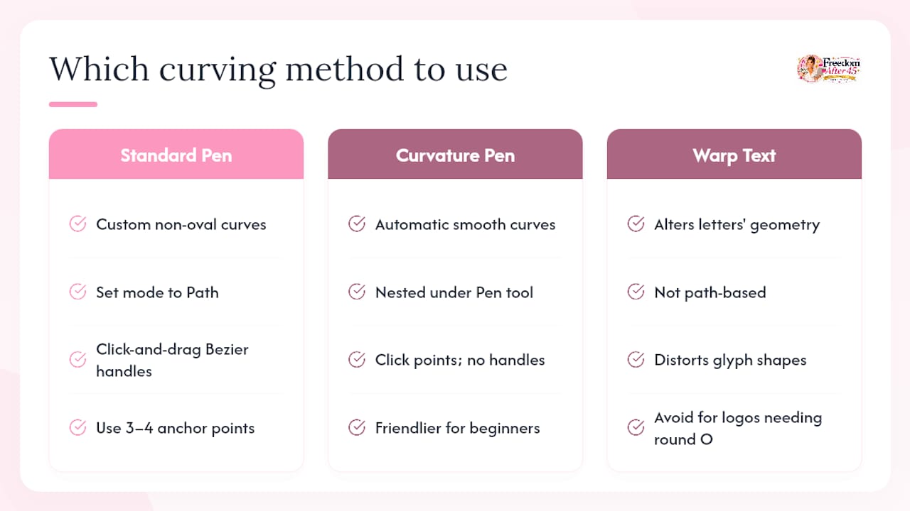
The Pen tool (or its friendlier sibling, the Curvature Pen) is the right choice when you need a curve that does not fit a standard oval — a gentle S-bend for a banner, an arc that matches a product photo, or an irregular shape for a badge.
Set the Pen tool mode to Path in the Options bar before you draw anything. With the standard Pen, click to place an anchor point, then click-and-drag the next point to pull out Bezier handles and create a smooth curve. Fewer anchor points produce smoother, more predictable curves. Three or four points are usually enough for a simple arc.
The Curvature Pen (nested under the Pen tool in the toolbar) is more forgiving: click to place points and Photoshop automatically creates smooth curves between them. No handle-dragging required. For beginners who find the standard Pen frustrating, start here.
Once your path is drawn, switch to the Type tool, hover over the path until the curved-line cursor appears, and click. Text flows along your custom curve exactly as it does on an ellipse. Use the Path Selection tool to drag the start bracket and fine-tune placement. The Direct Selection tool (A, then click the path) lets you move individual anchor points to reshape the curve after the text is already on it.
Practitioners consistently note that warped and curved effects are fundamentally different: path text keeps every glyph intact, while Warp Text alters the geometry of individual letters. For a logo where the “O” in your brand name needs to stay round, a path is the only correct tool.
Use predefined shapes (ellipses, rectangles converted to paths) when you need geometric precision. Use the Pen for organic, freeform curves that match a specific visual context.
How does Warp Text work, and when should you use it?
Warp Text is the fastest way to bend text in Photoshop without drawing a path. It keeps the type layer fully live and editable, which is its main advantage. The trade-off is that it distorts letter shapes — the Arc style, for example, compresses letters at one end and stretches them at the other.
To access it:
- Select your type layer in the Layers panel.
- Switch to the Type tool (T).
- Click the Warp Text icon in the Options bar (it looks like a curved T with an arc beneath it), or go to Type > Warp Text.
- Choose a style from the dropdown: Arc, Arch, Bulge, Shell Lower, Flag, and 10 others.
Key controls:
- Bend slider: The amount of curvature. Positive values arc upward; negative values arc downward. For headings, a Bend of 15–30 reads cleanly. Push past 50 and letter distortion becomes obvious.
- Horizontal/Vertical toggle: Switches the direction of the warp.
- Horizontal Distortion and Vertical Distortion sliders: Add perspective-style tapers. Leave these at zero unless you specifically want a trapezoidal or fan-shaped effect.
Warp Text works well for social media headers, decorative titles, and badge-style text where a slight letterform change is acceptable. It offers 15 styles with Bend and Distortion controls — enough variety for most decorative work. For a logo or any design where precise character geometry must stay intact, skip Warp Text and use a path instead.
How do you use Transform > Warp without losing editability?
Transform > Warp gives you a free-form mesh to push and pull text into almost any shape. The catch: you cannot apply it directly to a live type layer. Photoshop will ask you to rasterize, which destroys editability permanently.
The fix is a Smart Object. Here is the workflow:
- Duplicate your type layer before doing anything else. Hide the duplicate and keep it as your editable backup.
- Right-click the working type layer and choose Convert to Smart Object.
- Go to Edit > Transform > Warp.
- A grid appears over the text. Drag the corner handles, edge handles, or interior grid points to reshape the text. Pull Bezier handles on the corner points for smooth curves.
- Press Enter to commit.
Because the layer is a Smart Object, you can return to Edit > Transform > Warp at any time and adjust the mesh. The original type is preserved inside the Smart Object. To edit the actual words or font, double-click the Smart Object thumbnail to open it in a separate window, make changes, save, and close.
Transform > Warp is the right tool when you need text to conform to an irregular surface — wrapping words around a curved product, fitting a headline to a wavy ribbon, or matching text to a photo where a simple ellipse path would look mechanical. It is more work than Warp Text but far more flexible.
How do you avoid distortion and fix common curved text problems?
Dos and don’ts:
- Do use a path for any text where letter quality matters (logos, print, badges).
- Do keep bends subtle for body text — arcs above 30 degrees start to hurt readability.
- Do increase font size slightly on curved text; tight curves compress perceived letter height.
- Don’t use Warp Text for professional curved typography where character geometry must stay intact.
- Don’t rasterize a type layer mid-project unless you have a live backup.
- Don’t skip the Smart Object step before applying Transform > Warp.
Quick troubleshooting:
- Text appears upside down on the path: The text is running on the underside of the path. Drag the start bracket across the path line to flip it.
- Letters are tilted at odd angles: The path has sharp anchor points instead of smooth curves. Switch to the Direct Selection tool, click an anchor point, and drag the handles to smooth the curve.
- Spacing looks uneven: Adjust Tracking in the Character panel. On tight curves, increase tracking slightly so letters do not crowd each other.
Method comparison:
| Method | Letterform quality | Editability | Speed | Best for |
|---|---|---|---|---|
| Path (Ellipse/Pen) | Preserved | Full (live type) | Moderate | Logos, badges, typography |
| Warp Text | Distorted | Full (live type) | Fast | Decorative headings, social posts |
| Transform > Warp | Preserved (Smart Object) | Partial (reopen Smart Object) | Slow | Photo surfaces, organic shapes |
Keeping a non-destructive workflow throughout — Smart Objects, duplicate layers, a master PSD — means you can revisit any decision without starting over.
How do you fit curved text into perspective shots or real surfaces?
Placing curved text on a flat canvas is one thing. Making it look like it belongs on a curved surface in a photo is another challenge entirely.
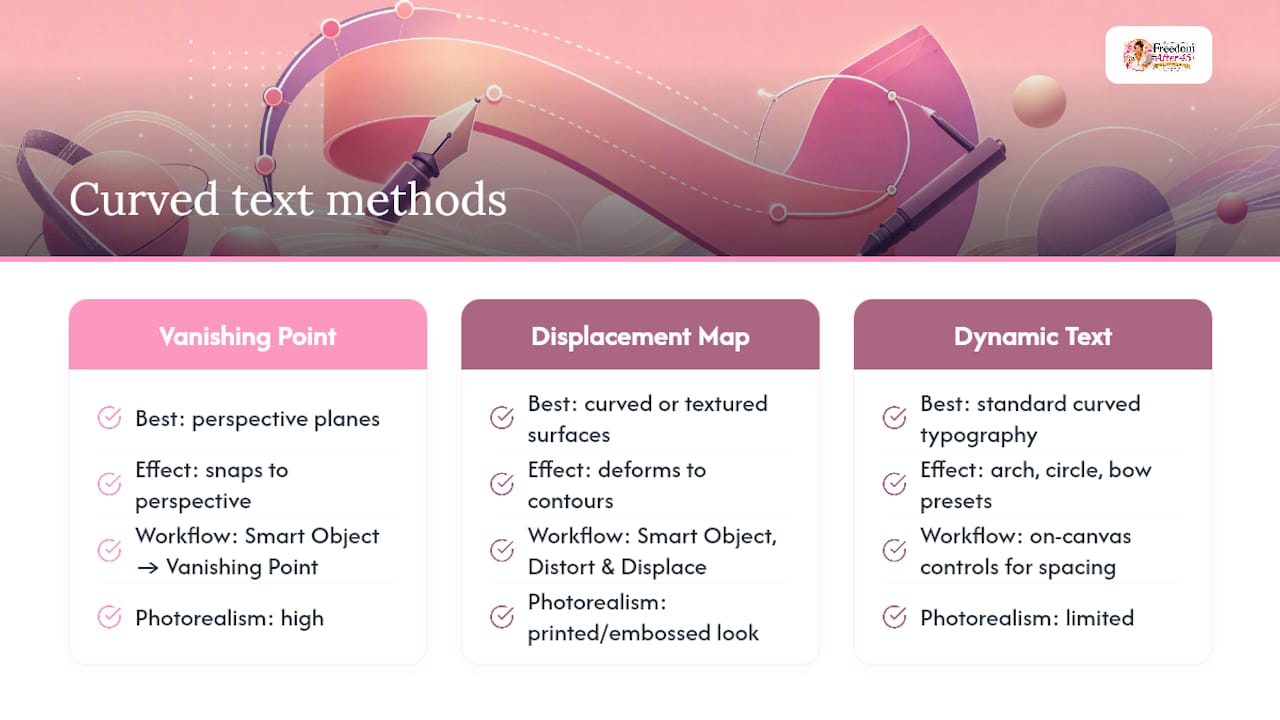
For perspective fits, the Vanishing Point filter is the most direct tool. Convert your text layer to a Smart Object, then go to Filter > Vanishing Point. Define a perspective plane by clicking four corners that match the surface in your photo. Paste or drag the text into the plane and it snaps to the correct perspective automatically.
Displacement maps go further for curved or textured surfaces. Create a grayscale version of the surface (the lighter areas push the text one direction, darker areas push it the other). Apply it via Filter > Distort > Displace. The text deforms to follow the surface contours, which reads as physically printed or embossed rather than digitally overlaid. Use a displacement map at a resolution larger than your final text area for the cleanest result.
Pro Tip: Convert the text to a Smart Object before applying any filter. Smart Filters stay editable — you can double-click the filter in the Layers panel and adjust values without reapplying from scratch.
Photoshop 2026’s Dynamic Text tool adds arch, circle, and bow presets with on-canvas controls for spacing and direction, which reduces the steps needed for standard curved typography. For perspective and surface integration, though, Vanishing Point and displacement maps remain the tools that produce photorealistic results.
Key Takeaways
Path-based curved text in Photoshop preserves letterforms, stays fully editable, and is the correct method for logos, badges, and any typography where quality matters.
| Point | Details |
|---|---|
| Path first | Use the Ellipse or Pen tool set to Path mode for clean, editable curved text. |
| Warp for decoration | Warp Text is fast and keeps type live, but distorts letter shapes — use it for stylized headings only. |
| Smart Object before Transform > Warp | Convert to Smart Object first so manual mesh warps stay reversible. |
| Always keep a backup | Duplicate the live type layer before converting to shapes or rasterizing. |
| Convert to Shape for logos | Use Type > Convert to Shape for final vector output; save the master PSD with live type intact. |
The path method is worth the extra 60 seconds
Most designers who reach for Warp Text are doing it because they do not realize how fast the path method actually is. Draw an ellipse, switch to the Type tool, click the path, type. That is four steps. Warp Text is three. The difference is one click — and the quality gap between the two outputs is significant.
The bigger habit worth building is the non-destructive one: duplicate before you convert, use Smart Objects before you warp, and keep a master PSD with live type. Photoshop CC and 2020 and later versions handle Smart Objects cleanly, and the 2026 Dynamic Text improvements make circular and arch text even faster for standard cases. Before finalizing any design, test your curved text on a sample file at the actual output size. What looks clean at 50% zoom sometimes reveals spacing problems at 100%.
Useful sources and further learning
These references cover the methods described above in more detail and are worth bookmarking for UI changes across Photoshop versions:
- How to Curve Text in Photoshop | Envato Tuts+
- How to curve text in Adobe Photoshop - Adobe
- How to Curve Text in Photoshop: The Ultimate Guide for 2025 | 33rd Square
- Warp text in Photoshop - Photoshop Essentials
- How to Create Curved Text in Photoshop Using the New Dynamic Text Tool - Photoshop Roadmap
- How to add perspective to text in Photoshop | Envato Tuts+
- How to write text on curve in Photoshop - CGIAN
- Quick Tip: The Correct Way to Create Curved Text - Photoshop Tutorials